Updated 24 October 2026 · Manually reviewed
Colour temperature describes whether white light looks more amber or more neutral. It is measured in Kelvin (K). A lower number looks warmer; a higher number looks cooler. It does not tell you how bright the bulb is—that is measured in lumens.
What each warm temperature feels like
2200K: candle-like amber
Best for very low evening light, decorative lamps and corners where relaxation matters more than colour accuracy. It flatters timber, terracotta and warm fabrics, but can make white walls and food look overly yellow if it is the only source.
2700K: familiar household warmth
The most flexible choice for living rooms and bedrooms. It feels warm without pushing every colour towards orange and works well in fabric-shaded lamps.
3000K: warm, cleaner and clearer
Useful where you need more visual clarity: kitchens, wardrobes, desks and bathrooms. It still reads as warm beside dark timber, but may feel too crisp for a very dim evening corner.
Quick comparison
| Temperature | Best use | Watch for |
|---|---|---|
| 2200K | Low evening lamps, decorative glow | Can distort whites and food colours |
| 2700K | Bedrooms, lounges, general warm light | May be too soft for detailed tasks |
| 3000K | Kitchens, reading, grooming, work areas | Can feel sharp when very bright |
Room-by-room starting points
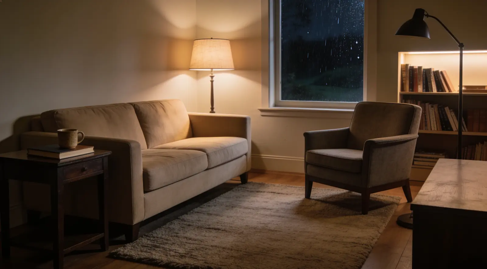
- Living room: 2700K for general lamps, with one 2200K accent source after dinner.
- Bedroom: 2200K–2700K beside the bed; avoid high-output bare bulbs.
- Kitchen: 3000K under cabinets for preparation, with 2700K in dining areas.
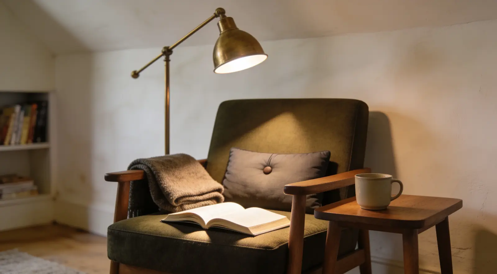
- Reading nook: 2700K or 3000K depending on page contrast and your eyesight.
- Hallway: 2700K at moderate brightness to create a soft transition between rooms.
A reliable three-layer method
Use ambient light for safe movement, task light where the work happens, and accent light for depth. The sources do not all need the same colour temperature, but they should be close enough that the room feels intentional. A 2700K ceiling source, 3000K reading lamp and 2200K shelf glow can work when each source has a clear role.
Common lighting mistakes
The largest mistake is using one powerful ceiling fixture for everything. Others include mixing visibly green or blue bulbs with warm lamps, placing exposed bulbs at eye level, and buying a very low-lumen decorative bulb for reading. Test one bulb before replacing an entire room.
Safety and efficiency
Use bulbs within the fixture's stated wattage limit, keep fabric away from hot lamps, and select reputable LED products with suitable local safety marks. LEDs use less energy and usually remain cooler than older incandescent lamps, but enclosed fittings may require bulbs rated for that use.